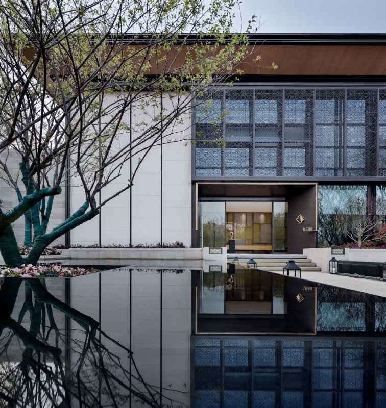
Working in concert with the conceptual lifestyle of residing within mountains and waters, the interior design stresses the importance of the seamless combination of space and God-made environment while echoing the strategic marketing orientation.
Visitors are led into it by the entrance at the southeast through plenty of two-by-four marble staircases. The pathway appears narrow and winding, geometrically decorated by high and thick metallic barriers on both sides. Faint internal views and the murmur of the spring harp by people. Along the path, there presents the sales office at the main gate.
Two large square waterscapes symmetrically are placed at the right front door. The sense of ritual arises when entering it. The hallway is enclosed partially by wired glasses and copper plates, emerging long and narrow rectangle extending to the right ending with the reception desk. Visitors see the property display area as moving through the hallway.
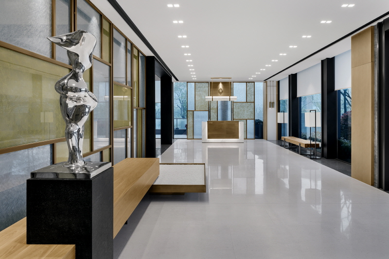
Sales and display areas are on the first floor. For the layout of this level, the architect attempted to abstract the element of PAVILION from classic Chinese garden and implant the concrete pavilions with a contemporary implication in larger volumes: two business areas and model display. The outdoor scenery and the display area were precisely at the perpendicular axis formed by those pavilions concerning optical sight and pedestrian flow.
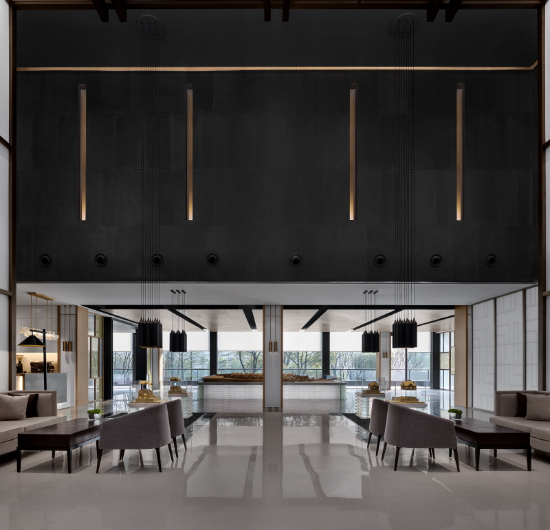
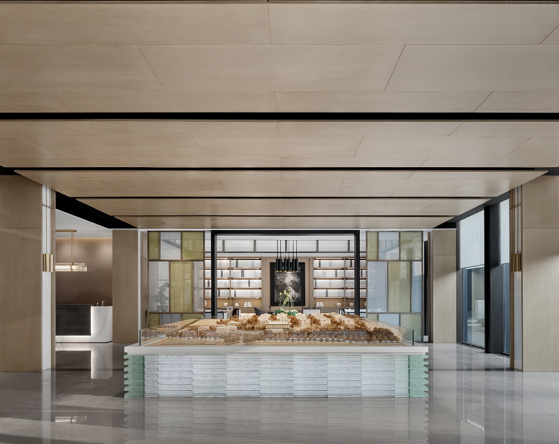
The carefully planned landscape one of the critical, significant attractions to the center. Referring Four Unique essences: forest, spring, stone and cavity, every space can experience different themes. The architect unconventionally arranged two business areas in the big space sealed by the floor-to-ceiling window at the side adjacent to the landscape with sufficient sun lighting. In the meantime, the property model was put in the shorter space to strengthen the tension of interior.
Wired glasses were used by a group of screens as well to divide different areas. Hopefully, the architect adopted the modern and traditional, lightsome and obscure element to reproduce spatial order and reform interior layout.
Contract area dominates in the second floor. The entrance keeps hidden in a series of wood finishes, and there is a stunning pine tree bonsai jumps into eyes when getting access to it. The ground of the tree was covered by pebbles, complementing the terrace on the third floor. The glass window in the contract room is enclosed by white and physical paper sliding door. Intense daylight becomes gentle through the transparent fabric.
入口位于销售中心的东南面,需经过几级窄窄的大理石石阶向内行进,其间小径窄而曲折,透过侧边高而厚重的金属栅栏,可以隐约看到内部的景象,并听闻潺潺水声。穿过小径后,整个销售中心正门便现于眼前。这段先有曲径通幽之妙,后有豁然开朗之感的“门户玄关”确是让人惊喜。
售楼中心共分3层,销售、展示和部分办公之外的功能作为会所以全面对业主开放。与项目“倡导城居而隐于山水的生活方式”理念相契合,在室内部分设计师亦强调了空间与周边自然环境的融合,并尝试呼应整个楼盘的风格定位。
巨大的方形水景,呈对称形制设于销售中心正门前,倒影建筑和园林,镜像延长表皮的线条,虚实之间演绎了建筑的沉静,而人行其间,礼秩之道带来的仪式感油然而生。
门厅由夹绢玻璃和铜板制作的屏风半围合,呈狭长的矩形,尽头设有服务台,引导客人穿过门厅,进入展示空间。
在细节设计上,设计师注意多重质感的交织,半透明的绢以薄雾状交错在古铜色框架中,传达一种含蓄。前台的古铜和白石材以灯带洗出利落的线脚,表现一种明晰。过渡性的材质是水晶玻璃砖做成的灯具,含蓄的磨砂感撞上洗练的轮廓,格外有趣。
一层为主要的销售和展示空间。布局上,设计师将古典园林中的“亭”元素进行抽象化的处理。“亭”的概念来自于“停”字,用作休憩空间,设计师希望在空间中,人们能够停留并感受项目,放松身心体悟生活。
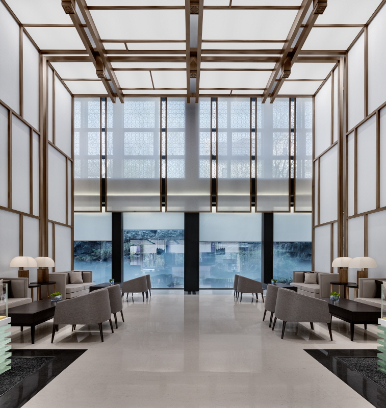
两个“亭”空间以现代意义穿插入大空间内,自然分理出3个区间:2个洽谈区,以及沙盘展示区。而户外景观和沙盘展示区也恰好地被布置于“亭子”的垂直轴线上,实现了视线与动线的双重贯通。
景观是该楼盘吸引客源的重要因素之一,通过老山四绝:林、泉、石、洞,为各个区域分别赋予了不同主题。设计师将挑空部分,规划为两处洽谈区,倚靠着落地玻璃,将户外的山林景观纳入室内,并获得了良好的采光,正所谓:园中布景,皆是眼前风景。
高敞的调控区域,让呼吸也变得顺畅,心情开阔。直射光被外檐格扇隔绝成稀薄的光影,流转在墙面上,几何纹理演绎成动态的图案,落在白壁上,形成光的画作。
挑空区沉浸在“白”的空间中,清奇的龙骨隐蔽在窗扇中,通过光的洗涤,构筑出圣洁的穹窿。黑色吊灯垂挂下来,周到地照顾着地面展示区空间。
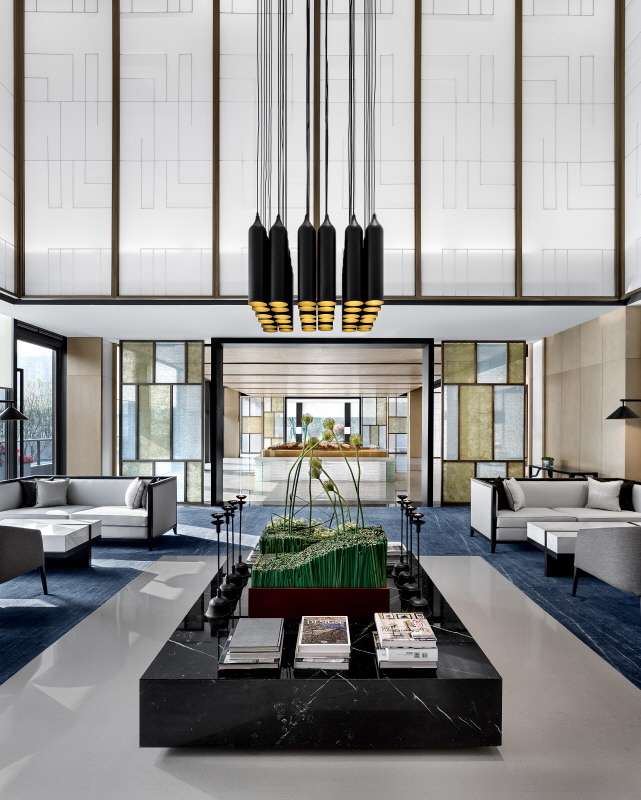
模型展示以素色为主,透过照明找出轮廓。地台设计别具匠心,仿佛一尊礼地的玉琮,只是黄玉为玻璃替代,抽离表面,只剩下通透的灵气。
格子窗疏密的肌理罗织出体量变化,大框架进入开敞空间,小框架安排在低空区。其内在暗含取传统建筑设计思想的精华:大料为为梁柱檩椽,小料为家具器玩,都以榫卯构筑,基因相同,体例大小多变。
在一层空间中,除了门厅外,洽谈区均次采用了夹绢玻璃的屏风作为空间区隔,设计师希望采用这一当代而又传统,轻盈而又隐晦的元素来重新建立空间秩序,以此梳理室内视觉语汇。
二层主要功能为签约室。入口隐藏于走廊的一系列木饰面中,推门进入首先进入视线的是一处大型的松树盆景,树下以白石子覆盖,与三楼露台处以“石”为元素的一处景观相呼应,有日式枯山水的造园意味。
签约室内部设计师紧扣自然景观和文脉传承。长立面的玻璃窗位置,被白色和纸材质的移门所以覆盖,带给人们更为充满禅味和遗世独立的精神意味。强烈的日光透过和纸稀释柔和,“时光不骄不躁,流年不急不缓,阳光不灼不黯”,清闲自在。源于自然的木、纸等元素,将诗与远方融于日常,现代宅院的隐逸和超然翩然浮现,再一次证明现代主义的包容性和多元性。







0개의 댓글
댓글 정렬